5. The Fault in Our Stars

I am absolutely in love with the font John Green used for this book. The crayon type look gives it so much personality in my opinion.
4. Just One Day
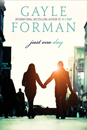
I feel like the cursive reflected on this book so well. The romantic aspect of this book is justified by the font on the cover.
3. An Ember in the Ashes

I LOVE the font on An Ember in the Ashes. Its big and bold and perfect, just like the book. I think the way letters look like they are burning just gives it that much more of an effect.
2. The Heir
Again the font on The Heir reflects the book perfectly. A fairytale, well sort of, should have a flowy, dainty title, and that's what Kierra Cass did. I don't know if the crown on top counts towards font but if not bonus points for that!
1. The Diviners

I don't know, there is just something about this font that captivated me from the moment I laid eyes on it. The dots in the middle of the words gives it sort of a 20's flare I feel like and the size difference was wonderfully played. This is definitely my favorite title font on a cover!
See you next Wednesday for a chat about banned books!! :D
~Morgan
Current Read: Still A Court of Thorns and Roses
No comments:
Post a Comment